
Friday, May 21, 2010


Wednesday, May 19, 2010


Tuesday, May 18, 2010

Monday, May 17, 2010
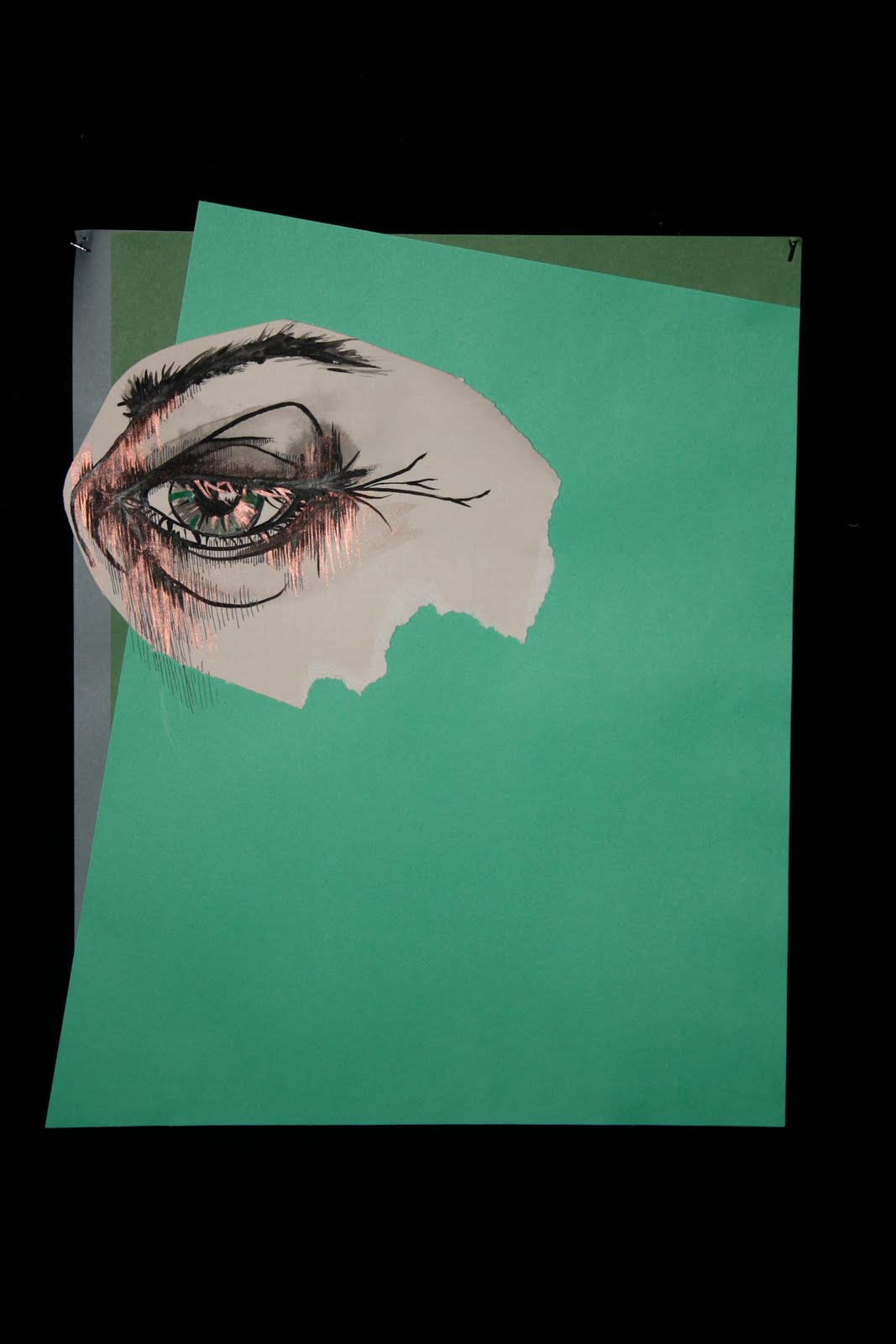
luna sketch + themes i want to paint on her


Gustav Klimts paintings are the basic idea of this luna's portrait. I want to study the color composition that klimt prefered to use. Not only the compostion of the colors but also the pattern and the stroke techniques
 will be the main part I will be seeking and observing.

Thursday, May 13, 2010

Wednesday, May 12, 2010

Tuesday, May 11, 2010


Tuesday, May 4, 2010


Sunday, May 2, 2010

Saturday, May 1, 2010
Kelsey's Portrait

My 10th piece, Kelsey's portrait is painted with lots of lots of purple.
She likes purple and she looks good on purple.
The mixture of her elfish and mature personality. Or her Energetic, friendly, happy bubbly (in a good way), exciting, caring personality could be all analysed in purple.
Also I have put some green at the right top corner since she is so into outdoor activities. Riding horses, playing soccer, having picnics... I thought green would decribe those prettay well.
Thursday, April 29, 2010


Wednesday, April 28, 2010
Jack.

My 8th piece, Jack Nachmanovitch's portrait.
His brooding personality. Shy but audacious in thought.
I described it in a very imaginary way. The stars and the purple+blue background give a dreamlike and calm feeling of the painting.
I am very sleepy at the moment so I will continue to explain about this painting tomorrow in the class.
Tuesday, April 27, 2010

Monday, April 26, 2010
sketch 1

The body and hair are going to fade away into the dark surroudings. I am satisfied with the sketch otherwise.

Thursday, April 22, 2010
kitty portrait. (not complete)

While Andy Warhol was inspiring me like crazy through this painting, I have spotted another great artist: Gustav Klimt.
Just like Andy Warhol, Gustav was insanely genius with the sense of colors. But his technique was more sophisticated. Unlike to Andy's simple and very straight forward one colored technique, Gustav decorated his painting with lots of different colors.
This slightly changed the appearence of my painting. Instead of painting with simple colors I decided to try some of Gustav's technique. From seeing 'The Kiss' to 'The Music II', I have noticed that he liked to use some variations of strokes like Van Gogh to emphasize the style of his painting. Therefore, I thought the yellow pattern and the polka dots would be something that Gustav would have done to my painting. Also, as I mentioned before, he never left out an area with only one color. I have put some blues around the yellows and some white, orage and purple around the polka dots.
I am going to get rid of the blue part. There are just too much things going on now. But yea, its not finished and this will be continued.
Tuesday, April 20, 2010
Libra

This is my 7th piece. The cropping tool is still not working, so I had to keep the black border.
Monday, April 19, 2010
Lucy 4/19/10

These are my 8th and 9th pieces. The red one is "Flirtatious" and the eye is "Anger." Tell me what you think!
Tuesday, April 13, 2010
kitty portrait. (not complete)

this is kitty's portrait. she wanted a lot of pink, i painted lots of pink for the background but this is not done. not even the half-way through. This is an oil painting so its such a pain in the arse. it never dries and never dissapears. So i decided to see what other people think and paint this more carefully.

This is andy warhols painting which my painting was strongly inspired by.
Macy's Boots


Here are the two views of my fourth piece, Macy's Boots. Do the photographs work? Any suggestions for the piece? I'm pretty content with it but always open to feedback!
Thanks,
Josie
Wednesday, March 31, 2010
5th piece

I'm not done with this piece...It's my fifth and the happily ever after ending. What do you think I should add? I definitely need to finish their faces.
4th piece
 This is my fourth piece, where Tam Lion is pulled off the horse by Janet. Any thoughts? I might make the background more dramatic with a darker color, like purple. Should I add some pen and ink in the background, too?
Wednesday, March 24, 2010
5th + 6th pieces


Here are Leo and Virgo. I've got a few issues with them, but they turned out pretty good.
Let me know if I should fix anything.
Tess 4th piece

This is Cancer... I darkened the photo a bit because I really wanted to capture the whole
"night" quality. Unfortunately, cropping tool is on the fritz so I had to do a close-up.
Tuesday, March 23, 2010

Saturday, March 20, 2010
Thursday, March 11, 2010
) This is Lucy.
This is Lucy.She is very calm, thoughtful and peaceful. She is individual and confidence.
I tried to convey these personalities through using differnt colors.
Medium colored brown, purple and blue represent her calmness. The surrounding yellow represent her individuality. Hope it does. Oh and what a surprise, it matches up with her working place, Spendoras.
I think the angle and face emotion show the confidence and ambition of Lucy.
I am still not quite pleased with what I have done so far. I feel like something is missing. Her left eye didn't come out well so I am going to work on it. I kinda messed up using 2 different paints. Tempera and Acrylic. This made the painting to look bit unnatural.
Overall, the painting came out as i expected, so its good. But I def need some feedbacks in order to make Lucy happy.


Tuesday, March 9, 2010


Wednesday, March 3, 2010


Seal
 this is my friends Katie as a seal! any suggestion. i like the mask but on both this and the cheetah the skin tone seems funny

Subscribe to:
Posts (Atom)